
← All work
Urban SDK Color Ramps
Research and a new set of map color ramps for a traffic-data platform, built to be easier to read and accessible to colorblind users.
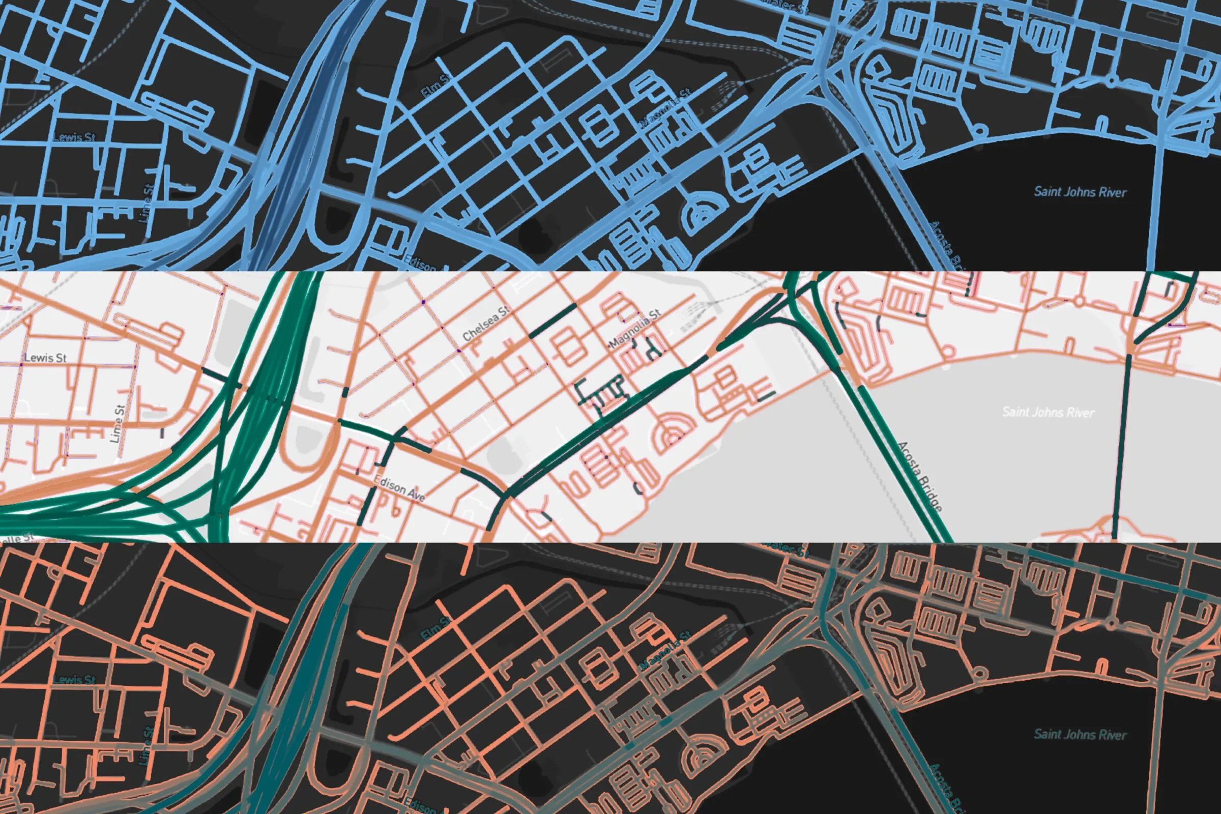
Gallery
Problems with the old ramps, and proposed fixes
Which colors to avoid, and why
Scheme 1, Urban Standard: sequential
Scheme 1, Urban Standard: diverging
Scheme 2, Alternate: sequential
Scheme 3, CIVIDIS: sequential
Ordinal ramp
Urban Standard on a dark base map
Urban Standard on a light base map
Diverging ramp in use
Overview
Urban SDK makes traffic and mobility data tools for city governments, and most of that data is shown as colored roads on a map. The color ramps doing that work had grown messy, so I researched the problems and designed a new set.
The problems
- Ramps used too many hues, so they didn’t read as a true low-to-high scale
- There was only one color option
- Higher values were shown as brighter colors, which fights against the map
- There was no diverging ramp for showing highs, lows, and averages
The approach
- Each ramp uses only one or two hues, so the order of values is obvious at a glance
- Pure red, green, and yellow are avoided. Viewers read red as danger and green as safe, and yellow clashes with the yellow highlight the software already uses
- Color pairs that blend together for people with protanopia or deuteranopia (like yellow to red or orange to teal) are ruled out
- Diverging ramps fade into the base map at their center, and every ramp has a light and a dark version
- Three schemes, each with a sequential and a diverging ramp: Urban Standard (on brand), Alternate, and one based on CIVIDIS, a ramp designed for colorblind accessibility
Like what you see?
Start a project